7 Flatlay Styling Tips for Product Photography at Home
If you've ever tried to photograph your products at home and thought, "Why doesn’t this look like the content I see on Instagram?"—you’re not alone. The secret isn’t a fancy camera or a professional studio. It’s knowing how to style a flatlay or eye-level shot, with the right props and good lighting, that does your product justice.
Whether you're shooting in your lounge, kitchen, or even on the floor, these 7 flatlay styling tips will help you get polished, scroll-stopping content right from home.
1. Find the Light (Natural is Best)
Light is everything. In South Africa, we’re lucky to have incredible natural light—especially between 10am and 2pm. Set up near a big window and turn off any artificial lights to avoid weird shadows or mixed colour temperatures. Cloudy days are great too—they act like a giant softbox.

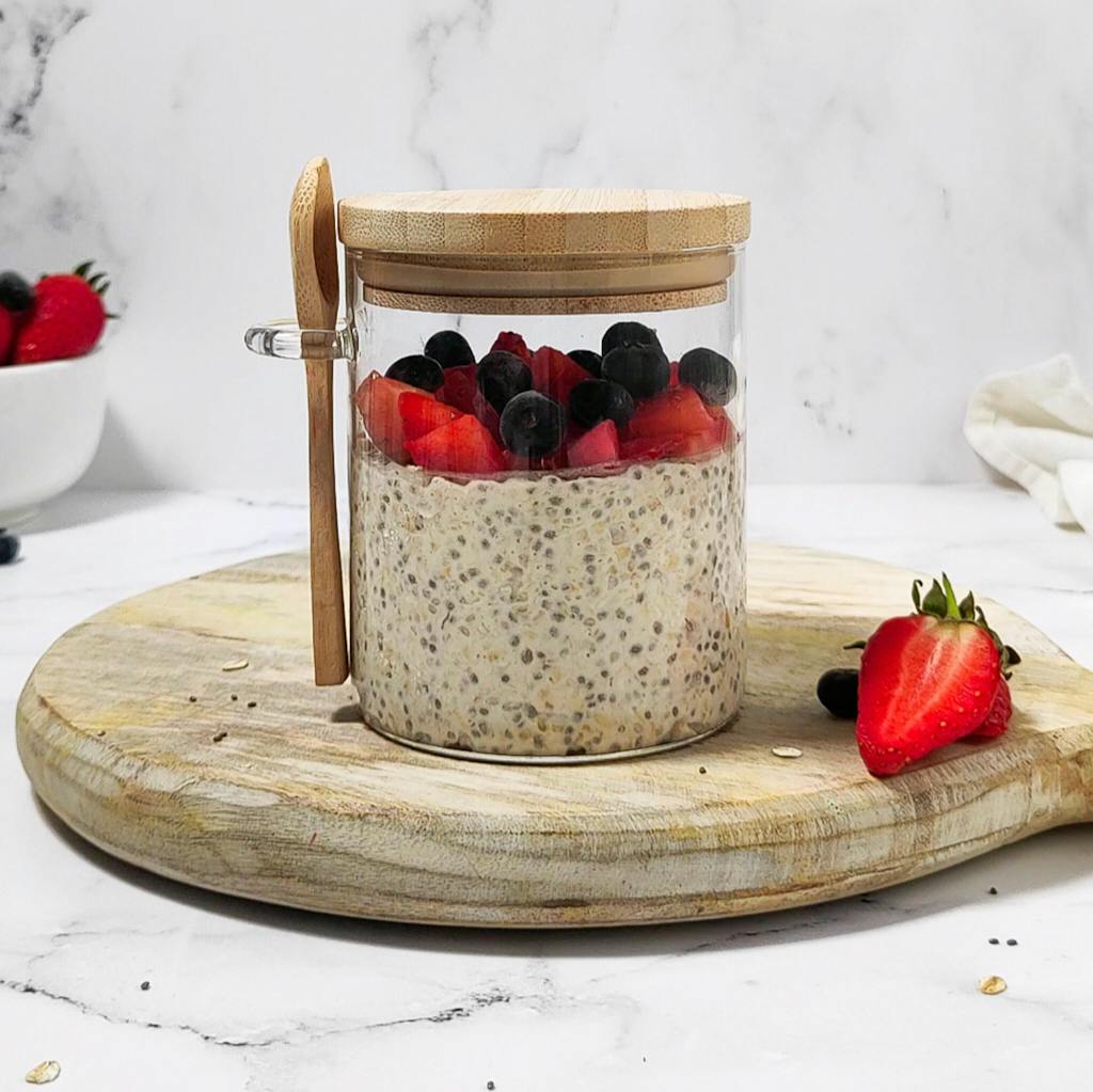
2. Use Risers to Add Dimension
Ever wonder why some product photos feel more "3D" than others? The secret is risers. By lifting certain items—even just slightly—you create depth and layers that make your flatlay more interesting. Try using acrylic blocks, small boxes, or our Flatlay Studio risers.

3. Think Diagonals and Negative Space
Styling in diagonal lines (from one corner to another) helps guide the viewer’s eye through your image. Leave some breathing room (aka negative space) so your product doesn’t get lost in the chaos. It’s okay for part of your board to be empty—it makes everything else pop.

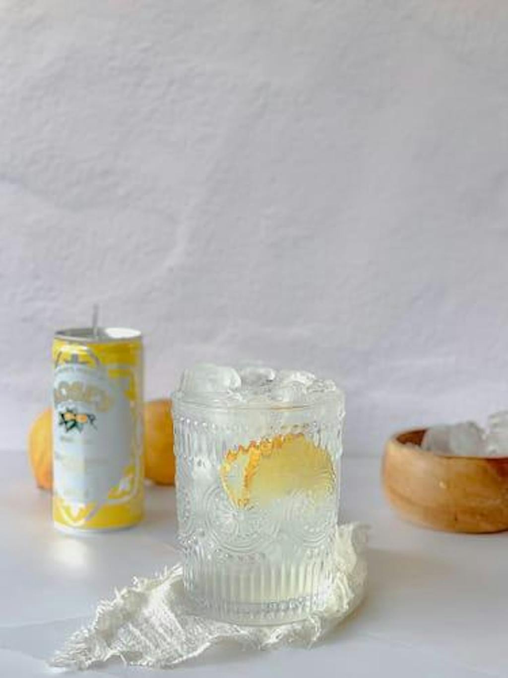
4. Pick Props with Purpose
Props are there to support your hero product—not steal the show. Choose 1–2 elements that make sense for your budget and for ease of use: a slice of fruit, a fabric swatch, or a tool used to apply your product. And remember: when starting out, less is more.

5. Style Off the Board, Crop Later
This trick is gold. Place your product setup just off the center of your board and leave space around the edges. You can always crop in after, and it gives you more flexibility with layout and orientation.

6. Match Backdrops to Your Brand Colours or aesthetic
Brand consistency is queen. Choose backdrops that reflect your colour palette—whether that’s soft neutrals, bold monochromes, or textured naturals. This helps your feed look cohesive and keeps your visual identity on point.

7. Edit for Mood, Not Perfection
Use editing to enhance—not disguise—your work. Apps like Lightroom Mobile (free!) let you brighten, sharpen, and add warmth without making things look fake.
Find 1–2 presets that suit your brand vibe and stick to them for consistency.
Final Thoughts
Great product photos are absolutely possible at home with the right styling strategy. And with Flatlay Studio boards designed for creators like you, you don’t need to spend hours editing or hiring a photographer.
Happy shooting—and don’t forget to tag us in your flatlays! We love cheering you on.

#ProductPhotographySA #FlatlayTips #WomensMonthContent